Outreachy report #36: August 2022
✨ Team highlights
We wrapped up our May 2022 cohort, Omotola’s first cohort! The most notable feat of this cohort was expanding our social media presence and interacting more with interns, mentors and coordinators. Our Twitter spaces helped us communicate with a wider audience. Our response times decreased, we processed interns’ feedback faster, and we took care of communication issues between mentors and interns before they became bigger problems.
💪 Getting better at it!
Some new contractors may not be familiar with the invoicing submission process. I’m onboarding new application reviewers (we have three more this time around) via video calls. We’re going through the ins-and-outs of their jobs and, if they’re paid contractors, I teach them how to use Conservancy’s RT to submit their invoices.
🔮 Improvements for the future
💬 Team communications
I’ve been in touch with a community of managers to learn more about how to improve team communications. I was introduced to concepts such as health checks, individual development plans, and the “4 Ls” format for meetings (loved, longed for, loathed, learned). In an environment where we have to be both generalists and specialists, I’m trying to find a way to create a balance where we have well-defined individual and group tasks and we can avoid burn out.
📑 Website design and user experience
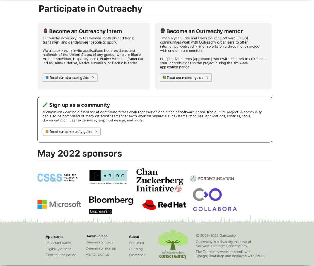
After a study about Outreachy’s user profiles, personas and scenarios, I created the first prototype of an alternative homepage for Outreachy:
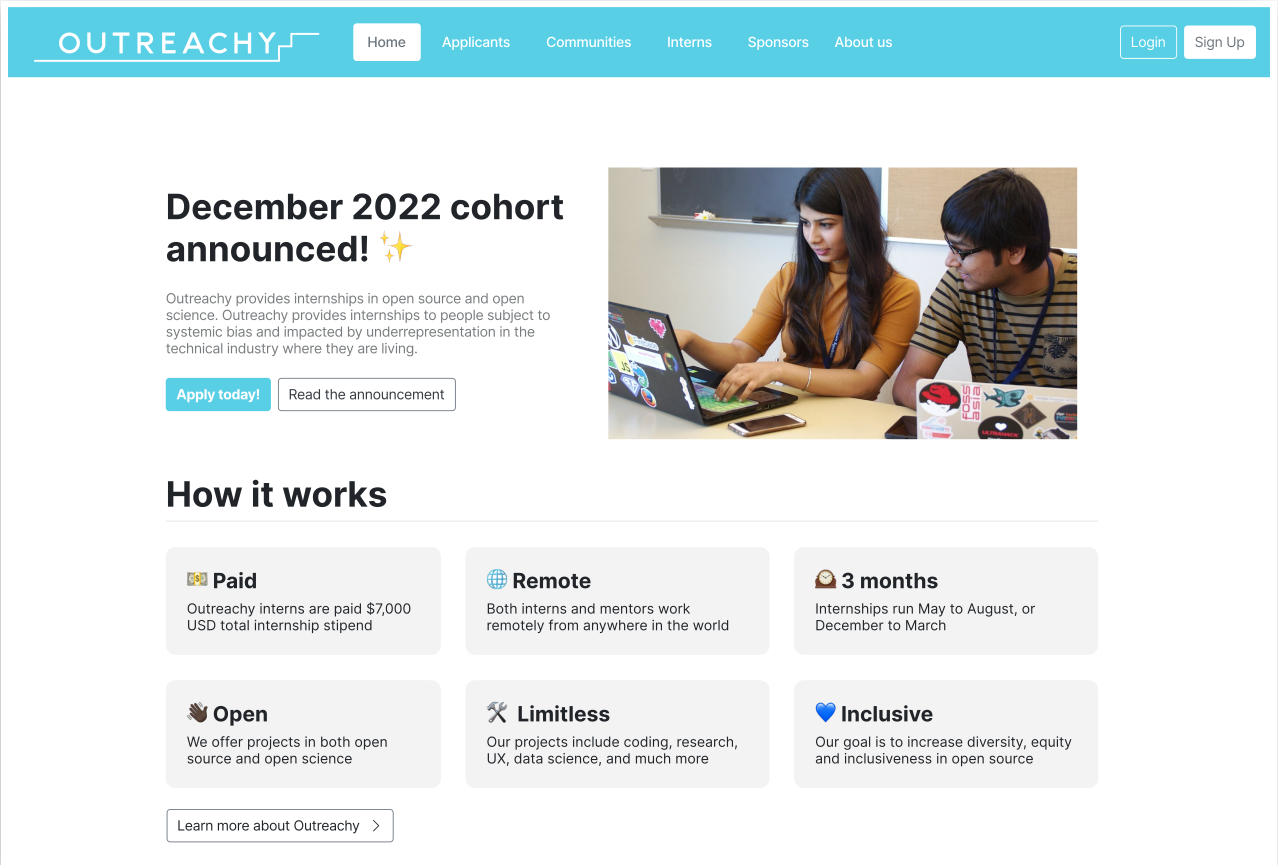
Things I improved:
- 🎨 Colors: The primary color of the website was taken from our logo. Currently, our website’s primary color is based on a legacy theme from GNOME.
- 📜 Standardization: The buttons for sign up and log in are on the right side of the navigation bar. Our current log in button placement is so poor it is often mistaken as a part of our logo.
- 🗓 Context highlight: The first information to be displayed on the front page is the most important information of the time period we’re in. In this case, it’s the December 2022 cohort announcement. It includes an explicit call to action: Apply today.
- 👀 Overview: Outreachy’s most important features are highlighted in a more dynamic way.
- 📣 Call to action: A section of our front page that tells every persona where they need to be and what info they need to know.
- 💵 Sponsorships: I’m trying to visualize a better placement for sponsors logos. Currently, it takes 50% of our page because they’re displayed vertically.
Things I need to work on:
- 🌳 Improving Software Freedom Conservancy’s visibility on this layout. Right now, it’s just a footnote.
- 📰 Figuring out how to display sponsors logos horizontally in a way that reflects the several sponsorship levels we have. I had colleagues suggest that it could be an animated slide show or carousel so the display time could be related to the sponsorship level they’re at.
- 📱 Creating a mobile view of the homepage to explore responsiveness on environments other than desktop computers or laptops.